How Many Interfaces is Too Many?
"When it comes to choosing, pick any color you'd like so long as it's black." Henry Ford's quip about vehicle color choices in the early days of industrialized auto manufacturing suggest efficiencies are maintained when we don't have to offer customers too many choices. Is that same conversation happening in your learning organization in terms of the user experience? Do you have one (or several) groups who insist they need their experience to be different than what your primary "system of record" makes available?
There is little justification for not accommodating all of your business units' various desires. Consolidating to one user experience sounds like it will make your tech support teams happy because they only have one interface to recognize and feel comfortable supporting. It seems like it might make updates easier. It feels logical that it might save you money. But are any of these really true, and is it going to be easy to tell your department heads that your centralized system can't be "customized" to meet their unique needs, and try to convince them that they should be satisfied with a "one size fits all" sort of approach?
Today's more innovative learning solutions help L&D teams both encourage and support bespoke UX/LX designs while still keeping your technical support teams and procurement departments happy. Even in Henry Ford's day, the Model T was a Platform Product: The design and components that are shared by a set of products in a product family. From this platform, numerous derivative products can be designed. And contrary to that initial comment about color, Ford actually ended up producing numerous body styles (2-door, 4-door, roadsters, pickups, town cars and sedans), all in numerous colors. Turns out, not everyone wanted black.
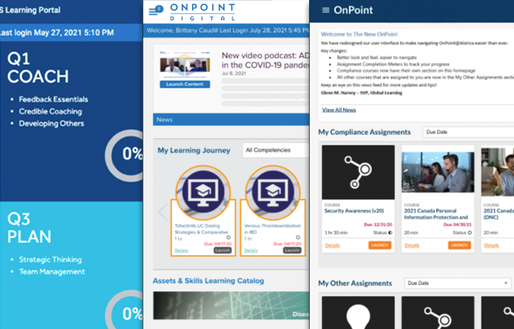
OnPoint's UX/LX solutions follow a similar design construct. They are all built from a standard "Base Package" foundation, then "configured" by turning on/off various features and functionality for unique user groups based on their requirements. The general "look & feel" and the overall page structures, navigation and interactivity stay static, but the branding, color scheme, and specific feature links can be specified for each group as they desire.
Customization is eliminated, and in its place is configuration. This ensures that the time to create a new interface is minimal, updates are quick and easy, and support is streamlined across all the interfaces. The result? Happy user communities, budget analysts, and help desk personnel.
OnPoint's typical customer supports anywhere from two to ten unique "primary group" user interface experiences. One customer was the clear winner, with 99 different server slices, each sporting a unique UI/UX for their users – all created using one primary template, then just associating the appropriate branding and color palette desired and applying the feature flags accordingly. So, how many is too many? The sky's the limit.